In the last few years, discussions around whether or not changing areas and toilets should be segregated by sex or gender have become increasingly common. When we ran the feasibility study for the Regent Cinema, we tested the idea of including gender neutral toilets instead of going for a gender-segregated option. From a design point of view, this option would give us a much better choice on each floor (given the relatively tight floorplate), and is hopefully more inclusive for a wide range of users. All cubicles are full height, include a sink within the cubicle, and baby change on each floor.
Now the cinema is complete, we provided the signage details for the new toilets. Keeping an eye on emerging discussions over the past year (many prompted by the controversial UK government consultation “Toilet provision for men and women: call for evidence”) it became clear that the previously frequently used “man + woman” symbols for all-gender toilets are becoming increasingly outdated as they are still binary, and refer to the people who may use – rather than the equipment provided within – the spaces.
I researched recent signage developed for gender-neutral / all-gender toilets, to see what has been done elsewhere, and how it has been received. Amongst other similar references, a 2016 Gensler study for San Francisco airport had polled a diverse focus group to find out which symbols they preferred for the toilets, in terms of legibility and inclusivity. A wide range were provided, and participants were allowed to draw their own too. The only icon which received 100% positive feedback was a line drawing of a toilet. It may not be glamorous, but it makes sense when you are looking for the loo…
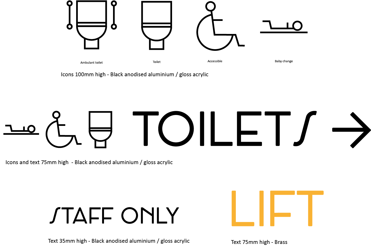
We tested a variety of options with the clients, including word and icon based signage, and settled on simple symbols, to show what is in each cubicle (a toilet symbol, a toilet with grab rails, a baby change symbol) and the current recognised accessible symbol, to be combined as required. The signs are black acrylic cut-outs, to provide clear contrast from the white doors and to match the wider colour scheme. We have attempted to inject some ‘Art Deco’ simplicity into style of the icons – decide for yourself if this has been achieved.
Personally, I think there is a lot of development to be done yet, both in the provision of all gender toilets and how we provide effective signage, but I hope this provides some food for thought.
![]()
More about Anna
Anna Cumberland is a Project Architect who supports both our architectural and consultancy team. Her portfolio spans hospitality, entertainment, workplace and residential projects across the UK, including several boutique and chain cinemas. She enjoys engaging with clients and end users at the early conception stages of projects, working closely with them to realise their ambitions for their new spaces.