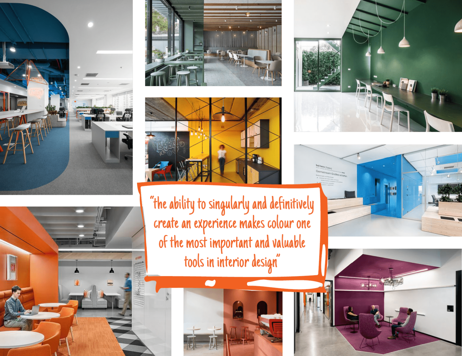
This month our interiors team wanted to share what has been inspiring them over recent weeks.
‘A smart use of colour is a cost-effective way to make small areas appear larger or open areas appear more defined. Colour can visually support purpose and function, add depth to a small space, add volume to a low space, and provide visual cues for way finding.’ – Charlotte Stone
The use of colour blocking to separate smaller, more intimate spaces away from a larger, main body of space, as well as applying a different colour finish on walls, floors and ceilings can provide a visual divide, but not necessarily a physical one – this allows spaces to continue to feel open and welcoming, whilst providing a change of function, environment and feel.

We have drawn inspiration from a variety of schemes that use pops of colour to define and divide spaces. Colour is also a great way to give a space a particular feeling – using warm tones to provide energy, animation and punch, and cooler tones to add quiet, calm and relaxation. No matter the scheme, colour can be applied in a way to provide diverse, distinct and individual spaces.
Here are a few schemes that we like, have taken inspiration from and have applied similar design attributes to in our projects:


![]()